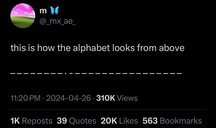
Only if you're using a bad font that doesn't differentiate between I and l
93 0 ReplyFixed-width Serif is the only way to go when doing any sort of coding.
However, Comic Sans is a surprisingly decent alternative if you want to use a Sans Serif typeface. The letters are easily distinguishable.
27 0 Replymonospace means the width of the "whole" character is always the same, but the width of the visible part of the character is not (imagine how large the dot would have to be for that to work)
...mm.m.6 0 Reply
Even if this is lowercase and the dot on the
idifferentiates then thelwould still be a dot.9 0 ReplyI was assuming it was all uppercase
3 0 Reply
Sans serif fonts are widely considered easier to read.
8 0 ReplyYou can pry the serifs from my cold dead letters
12 0 ReplyWe should follow Calculus's example and represent all lowercase l's as ℓ
Or just add serifs to I even in sans serif fonts
5 0 ReplyLast I remember, serif fonts were easier to read on physical mediums, and sans was easier on digital mediums. Never learned why though so, grain of salt and all that
3 0 Reply
Verdana > Tahoma > TNR >>>>> Arial, Calibri

7 0 ReplyYou gonna leave the hound as the only one unranked? That's no way to treat a dog 😛
2 1 Reply
They actually did different widths at the start, very impressive. But that tapered off, the W should be much wider.
31 0 ReplyAnd M a bit.
6 0 ReplyW for WUMBO
2 1 Reply
here i did the numbers 0-9
— - — — — — — — — —
31 0 Reply
15 0 ReplyForget the front, what the hell is that kerning man
3 1 Reply
Pixar lamp. Enough said.
13 0 ReplyWhy is
lnot a dot? I assume this is lower case12 2 ReplyGuess it’s upper case then.
21 0 ReplyBut upper case
iis not a dot?3 2 Reply
looks like it's uppercase
2 0 ReplyUppercase L
1 0 Reply
Who does a lowercase j with a line?
3 0 Replyit's uppercase, also j is still more wide than i
9 1 ReplyLowercase i? uppercase J?
3 0 Reply
Me.
1 0 Reply
There! In the spine of the dictionary the words are worthless. They are a mere weight pressing against my thoughtlessness.
2 0 ReplyFuck you too OP 😏
2 1 Reply😏
2 0 Reply
So the I is lower case, but not the J?
2 3 ReplyIt could be uppercase. This doesn't specify the font used.
8 0 ReplyJ is in lower case too, the line on the right of the i is shorter than the others.
2 0 Reply

