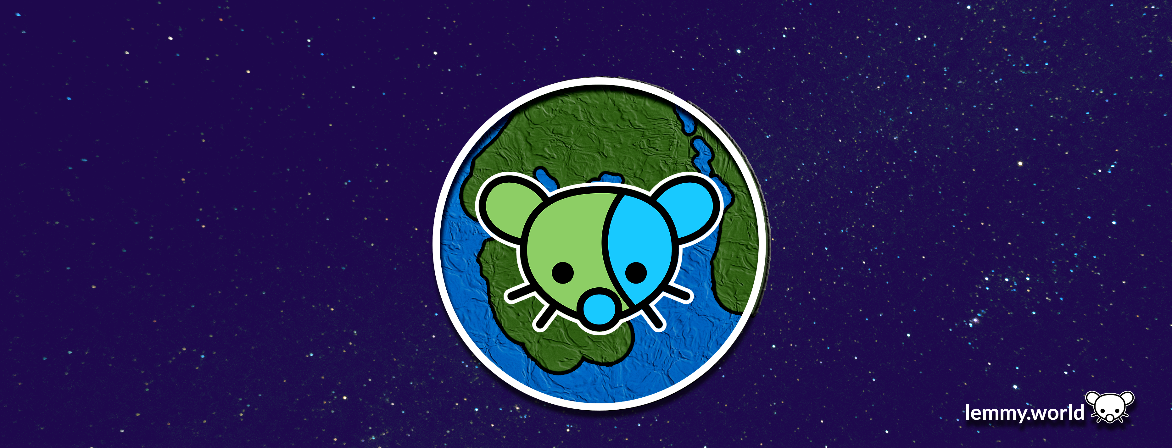
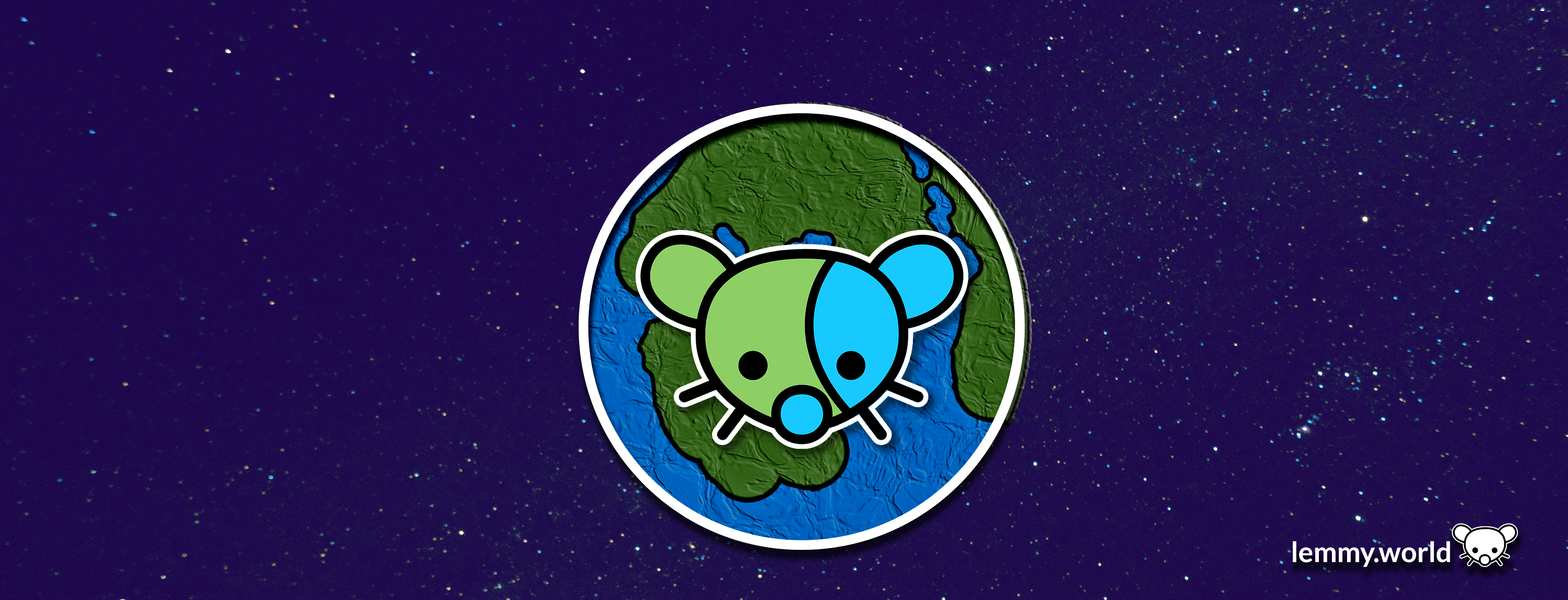
Proposed: Lemmy.world logo.
Proposed: Lemmy.world logo.
Here are some proposed graphics.
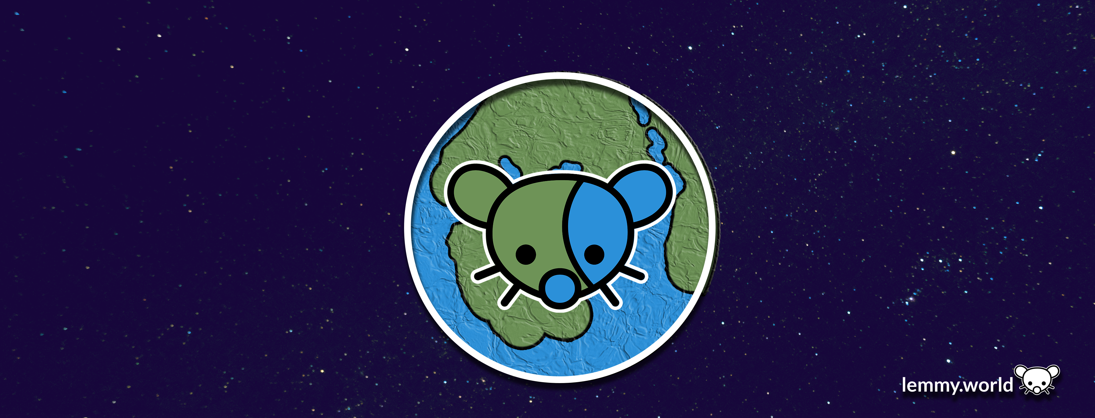
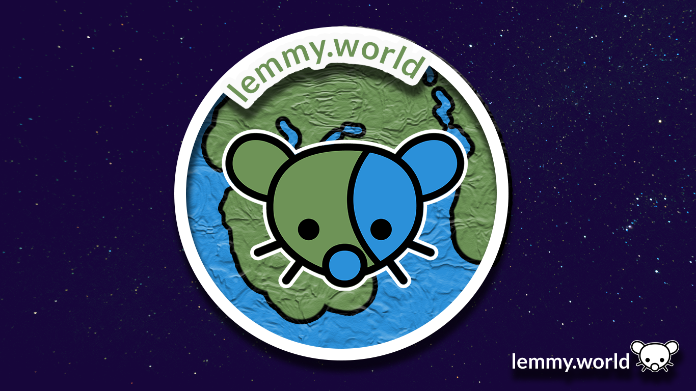


EDIT: I've now made a repository on GitHub, so that you can download the graphics and use them for your communities and projects. There's even an Etsy store selling stickers now.
Try making the left ear blue and the right one green.
Swapped.
Thoughts?

Definitely better!
Looks great! ❤️
Yeah, otherwise the lemming's face is camouflaged.
Agreed, that would look much better!
The bottom two would make a nice favicon on my bookmarks bar!
Just wait until Ruud turns on custom emojis! Then we will really be cooking with gas.
As a bit of a post script, I also made graphics for the Mastodon.world instance. So if these look familiar, well, it's because they are familiar! Thank you have having me here, Ruud, and to the whole Administrator team!
website seems to be down
Oh dear. That's concerning. I'm... going to go check on my hosting.
You: Which one do you like?
Me: Yes.
The first is by far the best. A logo is not a name tag. You don’t need to have lemmy.world written in it.
I guess if there were to be a banner, then #1 would be nice.
But for the logo I'd prefer #4
I made this 16x16 favicon (CC0 license)

🥹❤️
Oh, what a wonderful addition! That's a cutey if I've ever seen one @[email protected]!
Are you working with the site admins to include this? It will require scaling the png to 25% size, and a line of HTML:
<link rel="icon" type="image/png" href="whatever.png" sizes="16x16">
The bottom ones. Remind me of Braveheart 😃

"They may take our third party apps..."
Idk I like the design but the plastic wrap filter in the planet makes it seem too busy
These are great!
My best idea for a logo was the lemming-gerbil humping the shit out of a planet. It was... not a good idea.
Yeah any of these are honestly better than the current one.
Nice. These should be the defaults.
I love it
I’m digging the last two. Simple and minimalist.
congrats man, your logo is now showing on this site
I'm pretty hyped. I still have some edits to do and items to add/shift, and to send over to Ruud later. But this is going both on the fridge and into the resume! 🤣
idk why but it reminds me of Little Big Planet, especially the second one
anyway they all look pretty good, but if it will be displayed on the page next to the title, I think only fourth one will be visible clearly without getting close to the screen or opening image in a new tab
For the original effort on Mastodon, the Little Big Planet vibe was indeed an inspiration. The 'hand made' aesthetic is a really neat way to share that a place is being created and made by its users, and having it be a tangible, almost print or paper product, I felt it touched that key cultural element of both Lemmy and the work of the fediverse/activitypub.
Both 1 & 2 look better on a web browser but on mobile the globe has a weird texture look to it. I like #1 as a banner and #5 for the icon. I will say I also like the current icon.
I like the simple one with white bg.
this looks great imo!!
I like the first one the best, but the second one is also great. But they all look awesome.
Any logo is better than the current one tbh.
2nd to last one. Simple is better.
Yup.
2 & 4 are great.
4 looks like it'd make a good favicon - the shape is distinctive enough that, along with the colors, it should be easy enough to tell apart from other sites' icons when you have a bunch of tabs open.
2 is great for the general icon/logo on the website itself.
Dont really like any of them. They are to busy for no real benefit. The logos are not unique enough that you would instantly recognize them. Because they are not better than the current generic earth picture I say we just leave it.
#2 and #4. I like the detail and little extra going on for #2. #4 is nice because of the simplicity. Not too much going on but still looks good.
I like the one with white (transparent?) background.
I like 2 and 4. 2 Because it keep the "world" style globe.
I like the 3rd one as it looks like a lemmy world in space and doesn't get muddled by a background. Much better design aesthetic overall but the clarity helps a ton.
The 4th one is definitely the most readable regardless of sizing.
We need one of Apollo’s icon guys.
Oh, I love their work.
One user exported all of their icons. I've been flipping through them ever since.
Adorable, I love the ones with the earth in the background.
I like the three last most in order 3 5 4. I do also really like 1 and 2 but the texture on the planet makes them difficult and a bit weird to look at in a small size, at least from the look at the post thumbnail.
I like the last two, although the "world" part is less obvious.
Trying to get a picture with smoother anti-aliasing for the site logo. The jagged edges really bug me.

SVG file: https://pastebin.com/6ywmisZK
Good edit. Thing is, I think there's some compression going on in the backend, so even with an .SVG file, it might be somewhat complicated.
I'm going to probably make a quick GitHub page for the editing files with an .SVG, so the mod team, admin team and community managers can access all the files and edit them to spec.
But you're right: the pixelation on the edges is causing my artist OCD to flare up. Good suggestion, Margot!
No problem!
Everyone should start setting this to their profile picture on Reddit before we bail out forever. :)
Profile pictures? Wtf
New Reddit thing, I think. I've never used it, myself.
Love it!
Does lemmy have polls? It could be useful to see which one people like the most
looks clean and nice. good work.
Am I the idiot or is it really a penis next to its right cheek on the images with the globe? Maybe both.
Oh dear. Now that you mention it, I kinda see it too. Thanks for the flag: I'm... going to give it a think about how to shift it so that... isn't there. Maybe in the second version.
Things look very different with a fresh eye. Its so funny when unintended naughty things show up in designs! https://genitalsornot.com/
It won't help anyone to make a choice, but I love them all !
I like the bottom one I think. And number 3.
Why a mouse? Seems a few Lemmy instances have a mouse as a logo / mascot.
I believe it's supposed to be a lemming, but the ears are way too big.
Ah! It's an inherited piece of artwork, based on the mother instance, err, or the original instance of Lemmy.ml and the open source project itself. It's a bit of a nod to the musician, the Mario character, an old video game, and, of course, the adorable critter.
Excellent to know. Thank you!
The Mario character is named after the musician, so I found that point odd when I first read it.
I personally like the little lemming logo, but there could be a benefit of a more universally liked aesthetic that isn’t a rodent.
#2 looks a bit forced imo. #1 is better.
Here’s the logo with a brighter palette. In fact it was created using Mastodon Purple (#563ACC) as the root color for the new blue, and green colors so that "Ruud Worlds" harmonize.
Blue: 0/131/246
Green: 0/158/85
congrats but did you at least get a shoutout?
Oh! I got a shoutout on Mastodon.
With all of the bits and bobs in flux, it's all good. I'm already noted on the Mastodon instance and on the blog, and for other projects, so it's all good.
We're probably due for a monthly update in late July, when things quiet down and things get sorted. So, I think a shoutout makes the most sense then (or maybe later).
Ohh.. I really like these! If you want to do a banner for [email protected], that would be awesome! We need one...
I'm complimented by the request!
I recommend... Checking in with your community, first. I've always found when there is a group of folks who get together, and create together, form some really amazing bonds. So perhaps give your team on your community a swing at a banner first.
And, if no one puts their hand up, let me know in a month, and I'll see what I can do!
love them! much better than the current one id say, its got too much going on.
I miss the old logo. It looked very old internet. The kind of thing I'd see on the cover of a vaporwave album.
I'm digging the 2nd one. I like the 3D effect, though fear that it would be lost on smaller versions of the logo.
Very cool!
I like the first one!
I've now made a repository on GitHub, so that you can download the graphics and use them for your communities and projects. There's even an Etsy store selling stickers now.
I like #1 and #2 for the banner but the globe should be different colors than the mouse. It makes them too hard to distinguish and the image looks cluttered
Maybe like
Edit: actually would be nice with a shadow on the mouse too, like
Yes, that looks great! Having slightly different colours makes a big difference
Maybe the #1
Meh
Why can't it be a cat!
Why would it?
Because cats.
No reason why it couldn't be!
I think [email protected] would love a themed logo, with extra whiskers and cat ears! ♥️
Got 6 cats in my farm house back home in Australia and the number of mice they kill a week is in the double digits. Before I got them I had a burning hatred towards the little buggers.
