Are you guys tired of "Material You" design?
Are you guys tired of "Material You" design?
Are you guys tired of the "Material You" design? I don't really like the huge paddings on everything aspect of it. Also a lot of it feels too flat. What do you guys think?
As a UI/UX designer myself (hobbyist, to be clear), I really like it.
There seems to be this notion in the homebrew/FOSS/Linux community that "wasted space" is always non-preferable. I can see this being true for some people, but I feel like a lot of people are band wagoning this opinion.
It's pretty universally known and accepted in the design community that padding is extremely important when it comes to helping your brain read and separate content. And to be fair, most non-tech people prefer space and padding in their applications to make things easier to understand.
I can be entirely off base here, but TLDR: I like padding and it's literally beneficial to helping your brain understand the layout of what you're looking at better.
personal opinion, i think padding is worse for delineating objects than a bit of colour; or just, like, a line. look at this example - there are four distinct segments on the left, whereas on the right they all merge into one and a half
padding is really useful, yes, but if you put padding on everything then what's there to be separated?
The one on the right looks like different buttons and that everything is clickable. A quick glance shows you different elements and you can easily find what you're looking for. An example of form and function working together.
The one on the left looks like a text area showing different symbols. A quick glance shows you a blue area and a white area. Seems like you need that extra moment to find what you want because everything looks the same. An example of function over form.
Cramming a lot of things together isn't always good (probably it's just bad in general) because it just makes things confusing and ends up wasting time more than having bigger things but less of them.
The one on the right has more of a nostalgic feel of physical "buttons". Then again, it takes up more space so that your capabilities are restricted. Then again, square root, pi etc. - those are all more useful than INV, DEG, & e for me. So I could see where people could go either way, up to personal preference and even more so on the need that they are trying to meet. Although the one on the left just flat entirely wastes 3 buttons worth of space...
It's nice to see your perspective on it, you make some great points.
Its funny how the places that I dislike the most (status bar toggles and recently google search) are used often and thus do not need the benefits of reading and content separation. You already know by heart what it says and where they are.
Maybe I would like it more if the big padding would only be used in places where I do not interact often with. This would make consistency difficult though.
Good point but just because you know where certain things are on screen, that doesn't mean everybody knows. So you have to account for that too. Like design considering that that's the first time someone's looking at that screen.
UI dev here. To add to this, good use of “negative space / white apace” is also beneficial in signalling abundance. The more negative space you can afford to “waste”, the more resources you signal to have.
Luxury brand ads are good examples. Compare this Citizen Watch ad (https://images.app.goo.gl/mALYonDz6qzKJjuJ6) to this (https://images.app.goo.gl/sTXzyrFXNDUxR8AR9)
There’s a fine line between desirable ‘white space’ and too much padding, which Google should probably do a better job at finding.
While you're here, I'm curious about your opinion on the latest Spotify client design. It feels like they want to bring the desktop design closer to the touch screen client (maybe to reduce the codebase not shared by the projects). Personally, having grown up with Winamp, I find it very uncomfortable how images are dominant in both list and grid views, and how much space is left (really wasted) around texts. I think it's just a very inefficient interface with way too much useless visual fluff.
spoiler
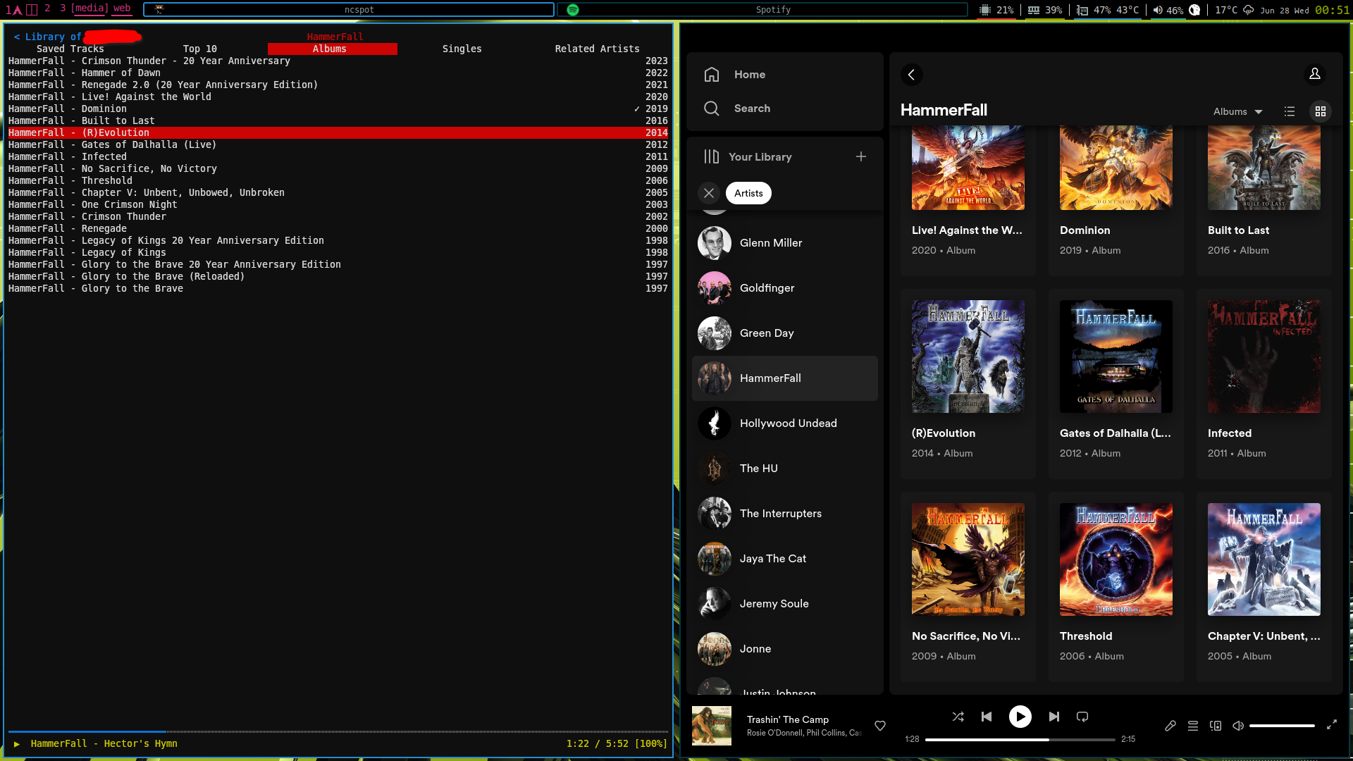
(the application on the left is a terminal-based client that really only needs a tiny corner on the screen)
Not who you’re replying to, but I don’t like the giant album art menus. Save that for a now playing screen that should still be able to be shrunk down.
My initial reaction was it sucks. It wasn’t great to begin with, but this felt like a major downgrade to me.
Padding sometimes seems like it's used as a crutch to get around placing stuff more thoughtfully. I agree there's nothing inherently wrong with it, but it is particularly annoying in feeds where it results in an excessive amount of scrolling
As a UI/UX designer myself (non-hobbyist), there's UI and there's UX. What differentiates a good-looking design from a crappy-looking design, most of all, is space (or padding). There are many other factors, of course, contrast being also very important for example, but space is number one. But that doesn't make a design good, just good-looking, which is a very different thing.
Adding steps to take a common action (turn off wifi or whatever) because you used to have a certain number of buttons and now you have to hide some to add space... That's bad design. Good looking, good UI. Shit UX.
Space should be added when needed. And you need it, when you do, to make thinks clearer. You shouldn't add space to make it look better if that's gonna make the experience worse.
The number one rule of design is that form follows function. You should make things as pretty as possible until you find the wall of functionality, and then you stop. Going from six quick access buttons to four was breaking that wall. You wanna be just on top of the wall. Go to one side, you get a great looking interface people hate to use. Go the other side, you get an interface that's dense and full of things you want, but looks like a piece of nerd shit.
I'm also tired of people repeating the same copypasted ideas about any new design system out there (as I'm sure most people are when hearing people talk about their area of expertise), but they are not wrong on that regard when it comes to material you. Shit name by the way.
Some padding is necessary and important to most good design; that doesn't necessarily mean all usage of padding is great, or that "more" padding is always better.
It's one of those "it depends" things. I've been working on a pretty data-dense webapp and as time goes on we've been shaving bits of padding off and instead relying on elevation and borders to signify the UI hierarchy of the app.
For normie apps where there's hardly anything to present, I think all the spacing helps people not get overwhelmed as much.
Yep, it all depends on use case. If the goal of the app or site is to wade through data, then extra padding is a waste of space and should be minimized.
Also, if it's something that you use quite a bit, then I often find the extra padding annoying as well. This is more about the user than the use case. As a user becomes more familiar with the app, extra steps (like scrolling or switching tabs) becomes less desirable than just having a jam-packed screen.
Clarity over density?
i agree
As a professional UX designer, the padding is the least of the issues.
I'm hoping I get used to it, but I miss more skeuomorphic design. It's like a designer wanted to push it to be edgy and forgot about real people using it.... which describes the bulk of Apple design, too, for that matter. I think we overshot the balance point.
Edit: forgot my real point halfway through commenting: I will say even that isn't the worst of it, though. The dynamic theming is a bit of a branding nightmare.
I miss the UI from android 4.3.. it was so clean and minimal.
I miss TabletUI :(
I'm not upset by it because, like all Google design eras, nearly no one uses it uniformly.
I'm over pastel colors, honestly. I want bold, vibrant colors. At least the option. It feels like Google is stripping more and more customizability with every update.
actually, google is planning to add bolder, vibrant colors in android 14
(but you can already use repainter app)
The dynamic colors are a fucking nightmare. No, I don't want all my ui elements to be the same color as my girlfriend's skin tone. And the worst is even if I change it, it resets every update. I also don't like the new quick access controls in the pull down. This is really the first Android update that's felt like a flat downgrade for me.
No, not at all. I am really fond of Material You. I think it is a nice mix of modern and playful. The colors are great too. I seek out applications that adhere to the material you standards and allow for using system colors. I have a Pixel 7 and a Pixel Watch. I'm excited to see what Material You looks like on the watch when the Wear OS 4 update comes.
Big fan of material you.
Design preferences has a tendency to be "cyclical" appearing to be tiresome. That's fine and an encouraged strength of customisablility.
The issue is unified design language across android devices. Material You attempts to solve this to limited success. But it's better than the alternatives I've seen in the past.
The over-padding (especially default widgets) is something I take issue with but it's a preference and can easily be adjusted.
I'm a fan - also I think material you allows for good interpretation/flexibility in terms of branding so that not all apps look exactly the same cookie cutter style.
Absolutely not.
I'm way more tired of the designs before it, or the apps halfway into the design language but not really. Especially if it is to the point where just using the material you colours you have seperates it, signal comes to mind there for example.
Some apps can keep their design layout but please let me use my material you colours anyways
yeah, i hated material ew as soon as it was announced. so much padding everywhere, and so little contrast - to paraphrase the incredibles: if everything's orange[1], nothing is. your eyes will adjust to it. i want actionable items to stand out, not be a slightly lighter shade of the same colour. it also looks rather like a fischer-price my first phone interface
i must say, if an app (for example, jerboa) uses material 3, i usually try to look for an alternative
[1] other colours are available, i just like orange
edit: some examples:
with material design, it's clear what's a header, what's a footer,[2] and what each button's state is.
with all the padding, there's also less space; leading to less functionality
with material ew, it's much harder to tell at a glance what each app is, one has to scrutinise the icon rather than just tell at a glance by colour
i also really dislike monet; the way it pulls this horrible washed out sickly pastel colour from a wallpaper and washes it over the entire app. if i just pulled one accent colour, and applied that to, say, the header and main action button, i'd like it a lot more
[2] look at the lack of contrast on that "new post" button
The colors I do like personally, it's the huge buttons that make me feel like it was made for the elderly lol.
Its nice to see everyone has their own take. :)
i wouldn't even mind the colours if they didn't tint the background. tinting solely the main text colour and the main buttons might look quite nice. to be honest though, i just loathe pastel colours in general, so it's possible that's influencing my opinion
Huge buttons are a general usability advantage if not overdone. Think about juggling bags while on a moving train and trying to pull out your transit app, for example.
The only thing I hate about MY is its comically big quick settings. Give me back the Android 11 quick settings and it will be fine (the Internet QS be damned)
If you are not afraid to experiment with some more advanced tools, AOSPMods has options to set the number of quick settings rows and columns, which worked well for me. (I was initially annoyed by this change as well, but I eventually got used to it.)
No, I wish more app used it. It's really fun and looks beautiful.
My main complaint is the amount of padding everything has, it makes things feel so cramped, even on a big screen. Increasing the information density would really improve the design, imo. Making colors more saturated would be cool too.
But other than that, the design is growing on me.
Definitely not, first of all I love pastel colors and, on the more practical side of things, at least for touch interfaces I do prefer to have some padding: even on larger screens (my current phone is 6.7") I tend to prefer larger and more padded interfaces to avoid hitting the wrong one (and that's the main reason why I don't like to type on a phone that much).
So I might even be in the minority but having a control center with larger but less buttons on each page is exactly what I prefer, I don't mind having to scroll if it's easier to toggle what I need to.
Ironically, one of the reasons I left Reddit in the first place was because I knew that old.reddit.com was going to be next on the chopping block and I hated the new design.
I'm resigned to the fact that I won't be able to avoid that aesthetic, even with a move to Lemmy since old.lemmy.world obviously doesn't exist (I'd love it though).
You can use user scripts to make lemmy look like old Reddit.
I find it and other modern designs to be boring, but I don't hate it.
i don't completely hate it, but seeing the same same UI in every app doesn't feel good.
I'm personally not that fond of it, and kind of want it to blow over in favour of a new trend.
It lacks the charm, and neat little 3D effects that skeumorphism had, but that's also not helped by it being implemented poorly.
Give me back Android 7, just in dark mode
Android 7 was so sleek. The quick settings were a god send
Indeed. And the settings sidebar was more useful than I thought, I want that back
I was offput by it so much on my last phone that I rooted it (first time rooting any Android) just to override it as much as I possibly could. For me, it wasn't because of the flatness, but entirely because of the huge padding.
The volume slider, which was a thin stripe before, now looks like a comically large bar for no reason at all. Small circular icons on the notification shade which could fit 4 in one row, now only fit 2 in a row. Pulling down the notification shade still let you see the screen behind it, but now it grays it out entirely.
As for the custom color selection, the main gimmick of Material You, it is entirely hit or miss. On my own phone, Pixel 3, I used a red/maroon color, and on my new phone, Pixel 5, I use a mint green.
There's situations where my chosen color looks really good, and others where it looks horrendous. As it turns out, having one universal color choice for things ranging from the notification shade icons, time display on the lock screen, calculator, etc. makes it difficult to find one color that looks good for all of them.
TL;DR: I hated it when it came out. I have gotten used to it now, but still dislike it immensely.
I love it and I wish more apps used it, it's actually a really good design interface and android's bigger problem is design fracturing than any particular design paradigm being bad. So many iOS apps feel like part of the same platform, and so many reddit apps are still using fucking holo UI
I like it fine, I just wish Google (and Microsoft, Apple, etc) would decide on a consistent UI theme instead of completely changing it every few years. They don't even have time get all their first party apps up to date with the latest design trend before they move on to a new one, and third party apps are even worse. I have apps on my phone in like 4 different UI styles now.
And it would be different if it was always improving, but these sideways or even backwards moves... forget it:-(.
I like it
I actually like it very much!
I'm still liking it a lot.
It definitely grew on me over time, and as more apps began to embrace it. Really well-detailed apps, like Sync, showed the true potential of what Material You can be like. It's also a little easier to distinguish the pastel and tint in sunlight (at least with sunglasses on), so that's a major plus.
I can't stand it, honestly. I recently moved from a samsung phone after like a decade of using nothing but samsung to a pixel phone and I really dislike how fat random ui elements are. The volume control is confusing to look at because it's gigantic, there's less quick settings tiles because the ones you do get are giant, and I dont really like the colour tint across the entire OS. Just because my wallpaper has grass in it, my whole phone shouldn't be baby shit green.
Barely any of my apps use it lol
Personally I love it. It was certainly a very jarring change from what I'd grown accustomed to in the years prior. But it's playful while also being clean and professional. Hope more devs implement it in their apps as time goes on.
What's the biggest difference between Material and Material You, other than the custom colorization?
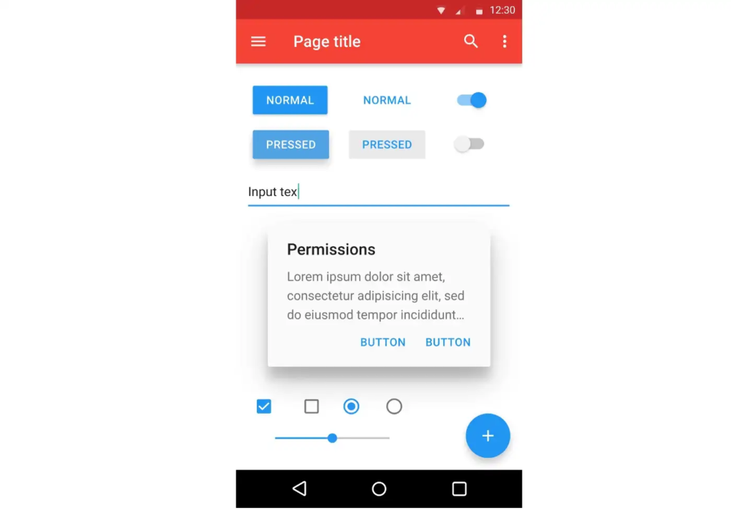
Migrating to Material Design 3
See that.
- Most corners are more rounded by default, especially buttons, which are pills now instead of rectangles. You could make them pills before and they offered examples showing how to do it, but hardly anyone did.
- Buttons are a little bigger, and there's a little more padding between most things.
- There are more transition effects, making apps feel a bit more fluid and "interesting", in a good way, I think.
- Nav bars and rails do a much better job of highlighting the active item, by adding a pill-shaped background behind it. (This one addresses a frequent complaint that I received when using material components on websites.)
- The rest is somewhere between "exactly the same" and "really minor", but the minor changes vaguely contribute to a different feel from before.
I love Material You. And thanks to Android if you can't stand it you don't have to use it. It's nice to have options.
I'm just kind of sick of Android in general, tbh. Google has killed off almost everything that made it fun to play with new Android versions, and somehow made it less intuitive/easy to use for advanced/experienced users in the constant pursuit of - ironically - ease of use. For example: why is it now a swipe and three taps to disable wifi in the Quick Settings panel, when previously it was a swipe and one tap?
It drives me nuts that I need to drag down twice to adjust screen brightness. It just feels icky to do that second drag, even hiding the brightness slider behind a button would be better.
I don’t like material or material you. They feel confused and they mix layers on top of your content which gets in the way to me. I don’t like the loud colour sections on headers against the stark white content backgrounds, it’s all too much.
Despite fear of sounding snooty, material is bauhaus design without the authentic materials, and the design elements are so focused on purism of being “material” that they forget they could be straightforward.
There will always be a need for a one-size-fits-all design, and I think it works well enough for that.
But yeah, I wish more apps took the extra step to specialize their layout to fit their own usage. Sometimes you are dealing with a lot of data and it helps to have different borders and less margins.
Android 11 was the last best Android version in terms of UI. I went back from Android 12 to 11
Came here to make this same comment. Android 11 was peak.
I hate it. Any wallpaper with a grain of red or yellow and everything becomes brown/beige and awful. I'm on Oneplus so i can't pick any colors, it's all automatic.
You can't pick on MIUI either
I hate that desaturate bluish background that is everywhere now. A lot of the apps look the same, and the removal of colours from notification icons just makes everything feel flat, soulless, and unsuitable for quick glances.
I love it, and also monet.
I like MY — I just wish I could design more of it on the user side.
Auto generated colorschemes are great and give Android a level of class it has been missing for a while. But I wish I didn't have to rely on a third party app like Repainter to finely choose my palette rather than hope the theme engine makes a good one. I also resent my icon shape, font, and icon options being ripped away from me.
There was a section on the original MY Google IO announcement that implies that the padding and roundness could be freely adjusted throughout the system. I wish that materialized (rimshot) into the final product.
The only objective regression I can think of with MY, rather than just an annoyance, is the Quick Settings. A merged internet toggle that no one asked for, a further reduction in a available toggles from Android 11, and not even bothering to make the Bluetooth toggle one of the fancy expanding ones instead of sending you to settings or surfacing the audio playback toggle (why can't I change the output before I play media, Google?). Ugh.
I didn't think I'd like it but I really do
Not "tired" of it, but I'm looking forward to more colour options rather than just pastel colours that sorta work half the time. I hope I can customize it a bit more in the next release.
I thought it looked really weird before I got to use it, and I still think that, now that both the apps I use, and my OS, have received the updated to M-You. I think it uses the available space horribly, and the color schemes it attempts to provide never feel like what I want
No, I love it.
I like the integration of adaptive icons for Android. I'm really keen on selecting a theme based on my current wallpaper and that color being used for all apps.
Not many apps are currently supporting it, even Facebook and other players you'd assume could do it in a seconds aren't.
Implementing it looks fairly straight forward, you provide a transparent image of your logo and it adaptive naturally to suit your theme. I assume apps are intentionally being difficult because that visually changes their logo / branding.
It's great when it works tho!
HOLO YOLO
I love it
Same, I like how playful it can be
I'm pragmatic, as long as it's easy on the eyes and conducive to read (in the sense in which you "read" an image, can't think of a better word), I'm good. I have always tended to cram everything and the kitchen sink in one screen and the push for material you has taught me the importance of a clean composition.
For now I'm good, but I'm open to change.
I don't particularly like it or hate it; I see it as the perceivably necessary new thing that's introduced each year to keep people interested.
I think it's trash but I admit most of the world now exists on mobile only. I also hate that fact but I accept it.
I still want Material back.
I'm okay with it, except for the sliders. I can't seem to differentiate 90%-100%
i always disliked material and material you. They look too coperate.
My main issue is the lack of good contrast, it really hurts.
I hate it. I wish it and similar flat, ugly UIs weren't everywhere. I get that some people like them, but I wish I could have all my devices' UIs look they way I want them to. Give me skeumorphic, glassy UIs any day.
I think it's nice as long as you have a custom ROM with root to tweak it. It's UNUSABLE on its default state.
But I still miss Holo and its mystique so much, it was perfect on small screens and needed some tweaking to be a mature, elegant, unique and expressive UI design language.
What changes do custom roms let you make?
True black background for OLED displays, AOSP Mods suite for 3 columns on quick settings, split WiFi/Data toggles, better scaling options for launchers, Lineage trebuchet launcher and derivatives, isolate apps like Google Calculator and Gboard off networking, theme engine tweaks for better generated colors and more.
Pretty much anything you can think about (even bringing back old QS or power menu). And if this isn't enough rooting enables you to make even bigger changes with apps such as Iconify or Substratum
I like it, I don't know
My short answer is no, matter of fact I'd like to see it being used even more. I really like Material You and I think it's one of the best design languages I've seen so far.
Before Material, I generally didn't mind UI languages that much, I just liked the #holoyolo lifestyle because it was dark. Material 1 came and I hopped on the praise DuARTe bandwagon until its end, but when I look back, I never actually liked it, nor did I dislike it. I always thought it was too square and a bit aggressive.
Material 2 is one that I disliked. It seemed like they just took away all the color and plastered whitespace everywhere just for the sake of making something different. There was no thought on form or function, it was just trendy minimalism (I love minimalism, but trendy minimalism is just that, taking away form and function just because less = more). That's also when I changed to Samsung devices and would barely see Material design anymore.
At first, I didn't believe in Material You. I liked what Google was trying to do, but all we had were design concepts that, as usual, never come to light. Then I started seeing it more and more and I understood. It seems like every piece of the puzzle fits together beautifuly, something that can join form and function without being a detriment to each other. The colors are subtle but there's enough contrast and shades to fit everywhere. The elements aren't square enough to seem like an outdated, old design, and also aren't too round to seem like it's trying too hard to be modern. The paddings are just right, and like another user here said, are very important to separate information and content. Obviously there are many flaws, but with a few tweaks, Material You could be a behemoth in design languages.
I kinda like it, it feels good to use and easy on the eyes. But at the same time it's too bland.
Wasn't a fan at the beginning, now I think it's great.
Reading from an app that uses material you design
I like it. I wish it was a little more customizable though. How much larger you want your headlines to be, for example. But I guess that's up to app developers.
All in all a pretty nice and comfy looking design language I think.
Impersonally like iOS designs. I like when things like Apollo follow the stock feel. It normally comes out nice.
Well why don't you get some rest if you're so tired?
I'm not. I actually like it. One of favourite apps sync for reddit made awesome use of Material You. I hope more of my apps support it. But, I do understand if some may not like it. An option to tweak certain things should be given IMHO.
My only issue is not easily being able to scroll to the bottom without overshooting to flip pages. I hate not being able to flip pages from the top, but not being able to quick scroll to the bottom too is really counter intuitive.
I'm not really a fan, there's too much empty space. I really like the Android 10 look and feel, but I understand that was for smaller devices.
Grown to liking it. I agree some areas could use a little less padding.
I don't come across many apps using it though.
It's alright, but I'm not obsessed with having everything conform to it like some people are
After having just upgraded to Linage OS on my OP 7 Pro, I am actually enjoying Material You. It's a nice change.
I'm not a fan of the huge padding or the "rounded edges" of it, much better during the KitKat days, in my opinion.
I love material you, the 'flatness' and pastel colors look really good to me (android 14 is going to introduce more colors outside of pastels though)
I love it
I love Material You when apps are designed to work with Monet color theming and use the default system navigation bar. Apps that deviate from that become an eye sore.
That being said, Material isn't my favorite design language for mobile OSes. I still prefer interfaces based on layers of gaussian blur, like iOS 7, Windows' Aero and similar.
I would love a phone UI that was more about those glass like layers stacking and blurring nicely.
I loved the look of Vista, it feels like macOS has been dipping its toe in the glass look for years but never actually taking the plunge.
I always style my terminals to have a strong Gaussian blur behind the window and as few decorations as possible. I think to me the Tron Legacy desk computer UI is the mood board I’d want for a new UI.
Oh man, don’t even remind me of iOS 7. So much promise, but it really hasn’t panned out how they (probably) envisioned it.
I miss old material design, the one we got to see with lollipop. Material you is... boring? It also doesn't seem consistent.
When MY first comes out everyone around seems to be a huge fan of it. I thought I was the one who got ancient tastes.
I was tired of it before they launched it.
No.
I love the original material design introduced in lollipop and gets polished in subsequent versions. Material you feels... idk, unfinished? I don't really mind the "bigness" of it, sure it could've been smaller, but what I really dislike about it is the color system that seems half-baked, for example I use a grey wallpaper and MY gives me light blue instead.
Yeah, I'm not going to say Google doesn't waste space. There's definitely a difference between stylistic padding, and literally not using a section of the screen for no reason.