You're viewing a single thread.
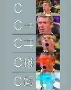
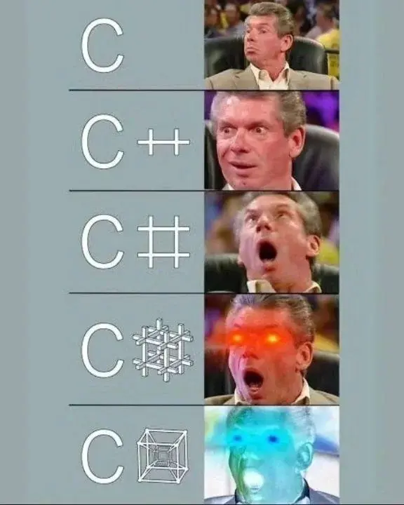
I've been a professional programmer for nearly a decade and I just realized that C# is C++++ with the pluses stacked
168 0 ReplyI know right‽ feels like when I learnt about the FedEx arrow for the first time
75 0 ReplyWhat FedEx arrow?
38 0 Reply between E and x
83 0 ReplyHoly shit that's crazy
59 0 ReplyThere's a lot of logos with hidden stuff like that.
Amazon's logo has an arrow going from A to Z, implying they sell everything "from A to Z"
The Tostitos logo has two people holding chips (the Ts) and a bowl of salsa (the dot on the I):

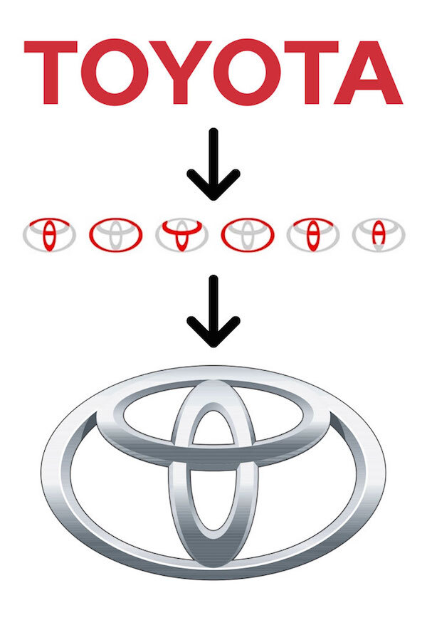
Toyota's logo has every letter of the company name in it:
The LG logo has the letters L and G in it:

32 0 ReplyI hate it so much, but the Baskin Robbins BR has the number 31 in it
8 0 ReplyWhat does it mean? I would guess count of assorted flavours, but I am no expert in numerology
2 0 ReplyARCHETYPE NAME:
The Misunderstood Genius
The digits in the number 31 have the digit sum 4 which resonates with the planet Uranus. 31 is often written as 31/4 where the digit sum is placed after the slash. To understand 31 more in depth we recommend you also read more about the digit sum 4 here.3 0 ReplyWhat a fitting planet, though
1 0 Reply
Yeah they have 31 flavors or something like that
2 0 Reply
Now if only LG could make a microwave where the LED display didn’t go out after a year.
4 0 ReplyI got mine 13 months ago, still going strong. I can check how much time is left on my phone anyway.
1 0 ReplyI guess that will be a useful feature when the built in display goes out.
2 0 Reply
It's interesting to me that they used the English alphabet for the Toyota symbol instead of Japanese. Or is that symbol localised?
4 0 ReplyI’d guess the Toyota one is just coincidental.
8 0 ReplyYeah, that's quite a stretch from the looks of it
3 0 Reply
The US is probably a much bigger market. I imagine it's the same reason LG is English alphabet and not Hangul. Same with Kia, Hyundai, Samsung, etc.
But this is mere speculation. I could be 100% wrong, happens daily!
7 1 Reply
It always pissed me off that they use this as an example of white space use. No one sees it.
19 1 ReplyLogo designers do.
7 0 ReplyBecause a prof showed them on the first class. But in any case, if logo designers are the only ones to notice, the logo fails its purpose.
5 0 Reply
Took me like a minute to find it
4 0 ReplyThere's also a spoon to symbolise that the couriers were fed soup.
8 0 ReplyHoly shit that's crazy
5 0 ReplyTo symbolise the ex was fed 🌚
2 0 Reply
Thats exactly what I wanted someone to do - post a picture because I was too lazy to google it myself! Thank you :)
1 0 Reply
o shit
4 0 Reply
I'm glad I wasn't the only uncultured swine unaware of the ++++ = #
18 0 ReplyYes, and that is on purpose! It was always meant to be a joke on C++ :)
16 0 Reply- TIL.
6 0 ReplyMe too - maybe because I was distracted by the irony that C# devs are typically the opposite of sharp... Or because it's MicroShit and I didn't give a flippin fuck ;)
7 53 ReplyCringy
25 5 ReplyDon't cut yourself on that edge kiddo
18 4 Reply
