GNOME 45's Nautilus File Manager Gets a Modern Full-Height Sidebar Layout
GNOME 45's Nautilus File Manager Gets a Modern Full-Height Sidebar Layout
who even decides what's "modern" anymore?
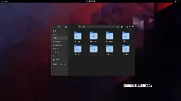
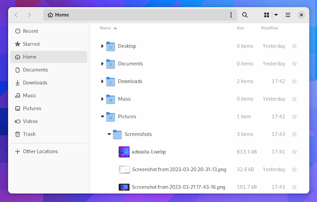
can anyone, honestly, without reading the article (or guessing from the headline), tell me which of these is the "modern" design?


edit: people are getting confused by the fact that one is tree view, not icons view so i changed the image. old image here
Apparently "modern" means hiding options behind extra clicks
I think "modern" can be interpreted as nice and clean UI which is beautiful to watch and only the absolutely most important stuff is shown and the rest is hidden. So, like apple design approaches, I guess. Say form over function. Microsoft tends to go that route as well. Luckily for user who like function over form, there are different flavors of Linux.
Clearly the dark mode is the modern one! Jokes aside, I just realized that there THREE menu options on that toolbar: hamburger, kebab, and waffle! I realize they do different things, but no wonder people are confused by and scared of computers. Also, now I'm hungry!
TIL of kebab and waffle menus.
as someone who's not scared of computers, i have no idea what they do. i assume the right one is icons/list/compact[^1] not a waffle menu, but the hamburger and kebab? i have no clue
[^1]: though why it's showing list when the current view is icons, i don't know either
It's just my opinion (since it's not in the article) but a thing that makes Gnome and Libadwaita a "modern design" is the fact that the production behind it tries to bridge the gap between a "mouse and keyboard" and a "touch screen" workflow.
None of the other DEs come even close to Gnome when used on a tabletAgreed, I'm not an expert, kind of new to linux, but I could see being very comfortable on a Gnome based tablet.
KDE is fantastic for tablets, I used it on my convertible ThinkPad for years
The first one doesn't waste space in the title bar by expanding the locator and navigator buttons there.
Petition to force anyone talking about software to use "trendy" or "fashionable" instead of "modern".
Full height sidebar - from Mac OS 7 or so - must be modern?
It'd be kinda nice if they made these kinds of changes options rather than just deciding this is best
Could honestly take it or leave it, doesn't really add anything
-
Adding options
-
Gnome desktop
Pick one.
-
Well I just switched to KDE Plasma last week and I'm pleasantly surprised just how many things are configurable via a menu and how well it runs on Wayland With a Nvidia GPU.
I used to despise KDE Neon, and used Gnome for a bit, but I don't think I can go back anymore until their design philosophy changes again.
"Modern" means copying Mac OS or iOS.
Honestly, I haven't yet seen the article, the light theme one is probably newer because of tabs.
Anyways both look like an android app, I know most will hate reading this but Windows Explorer rules.
nah, i agree with you. win explorer with qttabbar, tortoisegit, and some tweaks from winaerotweaker
dolphin is pretty good though and it has some features that explorer doesn't, like a terminal pane
The bottom one looks like a mobile app interface, so it must've been the "modern" one.
I'm very glad GNOME does such an amazing job staying modern in its look. GNU+Linux and free software would be much worse off without it.
Great. Now do split panel!
And column browse
I’d love a setting to change the default file manager. I always install Nemo and configure it to be the default but last I checked, it’s not a simple GUI setting like changing the default browser or email client or whatever. And then you end up with two programs called “Files,” which obviously isn’t ideal.
Would it be that much of a problem to have what app is “Files” be a simple setting? Maybe it’s way more complicated than one assumes.
My dream is that one day we will be able to assign default applications to the “generic” names in Gnome. Launch “Browser” and open Firefox (or chrome 🤢), Files and open Dolphin, Messages and open Elements etc etc.
Obviously I can do the same with custom .desktop files but it would be a nice flair to use the settings to just assign applications to those generic names.
You can set the default app in the settings though, right?
Yes and no. The setting affects the file manager, but things like "open/save file" dialogues will still use the Gnome file chooser, which is separate from Nautilus and not easily circumvented.
On my kids' pcs the default file manager is nemo and they use gnome, so it is possible
Would it be that much of a problem to have what app is “Files” be a simple setting? Maybe it’s way more complicated than one assumes.
It wouldn't be that difficult, but it's definitely outside the realm of possibility with the current gnome team.
They have this 'our way is the best way' approach, which makes their jobs easier because they don't have to support different settings.
I don't like Nautilus and always srick with Nemo but the new look of many Gnome apps is really nice!
What's the advantage vs. the current version?
Also looks like it's removing an important visual affordance (i.e., which areas you can click to drag the window), unless I'm misinterpreting it
The current version has some problems with adaptivity, e.g. resizing the app window can cause issues. This led to the creation of new libadwaita widgets. If you want to read the technical details, see https://blogs.gnome.org/alicem/2023/06/15/rethinking-adaptivity/
Also looks like it's removing an important visual affordance (i.e., which areas you can click to drag the window), unless I'm misinterpreting it
The top bar has been full of buttons with no whitespace for a year or more now, that's not new (you can still drag the window using the whole bar, but it's definitely not intuitive and made me subconsciously do Win+drag to be safe many times).
This seems to be a relatively minor visual update to have the left sidebar fill the whole window -
maybe they want more space for shortcuts at a given window height?No clue.Edit: never mind, checked again and it's literally just a tiny visual update with no change to the actual content of the sidebar, but it takes some space away from the top bar.
Been a Gnome user for years and always glad to see them modernize the UI more, but the one thing I desperately want is .stl and/or .3mf thumbnailers to just work with Nautilus. Tried several times to set up in Fedora using f3d, but instead just get blurry question mark thumbnails
Wow, revolutionary.
I kind of agree, it's nothing special, but the new window management they talked about sounds exciting actually. But thats far in the future.
Please also remove the text places and make use of that space
Gotta keep up with Apple you know ahah
Only if they could copy the original Exposé from macOS Tiger.
I just want someone to finally copy column view from Finder. I know Ranger has it but it would be nice if Nautilus or Dolphin would implement it.
Looks nice, but if I could trade these visual gimmicks for a type-ahead feature, I would do so in a heartbeat.
gtk3-classicanyone?
So glad KDE exists.
I used GNOME for close to 20 years, but finally dropped it with the release 40. I've had enough of them breaking features.
By that time KDE finally stabilized and it does everything I want, my way.