Me too! And I'm still using it, dev is on fire and it's getting better by the hour, love it 😊
I've tried compiling all the suggestions from this thread, with BGG links.
I have a 4 and 6¾-year-old, but our game collection doesn't quite fit the audience, and we usually end up playing Star Of Africa with heavily dumbed-down house rules (and it's already a pretty dumb game to begin with) to keep it interesting for the little one.
This thread is gold! 😍
- [My First Stone Age] (https://boardgamegeek.com/boardgame/191004/my-first-stone-age)
- Outfoxed
- Rhino Hero
- [Race To The Treasure] (https://boardgamegeek.com/boardgame/121806/race-treasure)
- Robot Turtles
... Sorry I'll finish this up later on desktop, this is too fiddly on mobile 😅
Seconded! Also, clearing read and upvoted comments on Refresh. If possible, the ability to manually hide posts.
Just downloaded, as I was getting frustrated with Jerboa. So far I'm liking Connect very much, and I have a few suggestions for improvements that might be worth looking at:
-
It seems tapping a comment expands the comment options menu (upvote, etc.), and you need to long-press the comment to collapse it and its children. I would love to be able to switch this behavior around (tap to collapse), as well as the option to always show comment options.
-
This comment field is using only half my screen. I would love it if it used all the available space, shifting the formatting bar down to rest on top of the keyboard. There is a lot of wasted space at the moment.
-
The colored vertical bars that show comment indentation have a lot of spacing. They would work perfectly fine with a few pixels worth of width and no extra spacing.
-
I don't know how, but this comment field is wreaking absolute havoc with my keyboard 😟 I'm using Gboard, and it's behaving completely different here than in any other app on my Android phone. Swipe trails are jumping all over the place; after typing a word wrong and clicking backspace, instead of deleting the word, only the last character gets deleted. Tappinga single letter word (e.g. 'a') aftera swiped word doesn't adda space like normal. I didn't fix this manually in the last sentence as an example.
Looking forward to future updates, and I'll be back with more feedback when and if I come up with some 😊
I just migrated from Reddit, and liked what I read about BeeHaw. Signup was a bit confusing, but eventually just sent an email to the team, wrote a bit about myself (education, family, interested, political leanings, probably massively oversharing 😅), and got an invite a few minutes later.
So far I really like the tone in here, and especially the quality of the comments. Feels like Reddit at its best, nice and helpful people.
I was on Reddit for 15 years (plus a few years lurking), and it's been my largest casual time-sink throughout. Leaving sucks. In the end, I couldn't accept losing my Android client — 10 year anniversary with Relay a few days ago — the thought of having to use the official app made me gag, as probably 95% of my Reddit time is on mobile. So I left for BeeHaw/Lemmy, and now I have to work with something that's (from a UX standpoint) probably even worse 😅
It's the principle, though; they're fucking over their users so incredibly hard, and I don't want to be a part of that anymore. Even if that means having to use a platform that isn't mature yet. Fuck it, I've been here before, and I can cope with having to start over again. I hope Lemmy can get to a point where there's a great experience to be had on mobile (I'm currently on/in Jerboa, btw). Maybe you're the one to fix it? 😍
So — a few things that I'm struggling with that might be worth considering for your app:
-
The ability to hide read/upvoted posts! This is my main pain point, by a very wide margin. As a Relay user, I'm used to a fresh screen with fresh new posts every time I open the app. Not so in Jerboa. Open app, and there is (potentially) a very long scroll ahead of me too get past posts I've already read and upvoted. I can look for upvotes, but I don't upvotes everything, so not a perfect indicator. The only functional one seems to be a slightly greyed-out post title (dark theme). My current understanding (very limited, granted) is that this is a Lemmy thing in general, not just Jerboa. Something about lacking the ability to react to a post being previously viewed æ upvoted? Either way, I'd love a setting that would let me hide all posts that I've upvoted, or hide all posts that I've read (clicked). Also the ability to manually hide a post from the main list view (get rid of something without having to upvoted or click on/into). In combination with a Refresh-button, maybe?
-
Better options for sorting posts (newest / popular / etc.). Probably also a Lemmy thing.Sorry, this seems to be there already, I'd just missed it somehow. -
Not having to manually scroll this text box up constantly because what I'm typing is disappearing behind the keyboard. Seriously, Jerboa? 😑
-
The ability to hide the downvote button, probably on a per-instance basis, as some allow downvotes, and some don't.
-
The ability to turn off excerpts on the front page.
Sorry, have to go to a meeting, will try to come back to this later and add more suggestions 😊
Good luck with the app! Can't wait to see it 😃 It's for Android, right? 😬
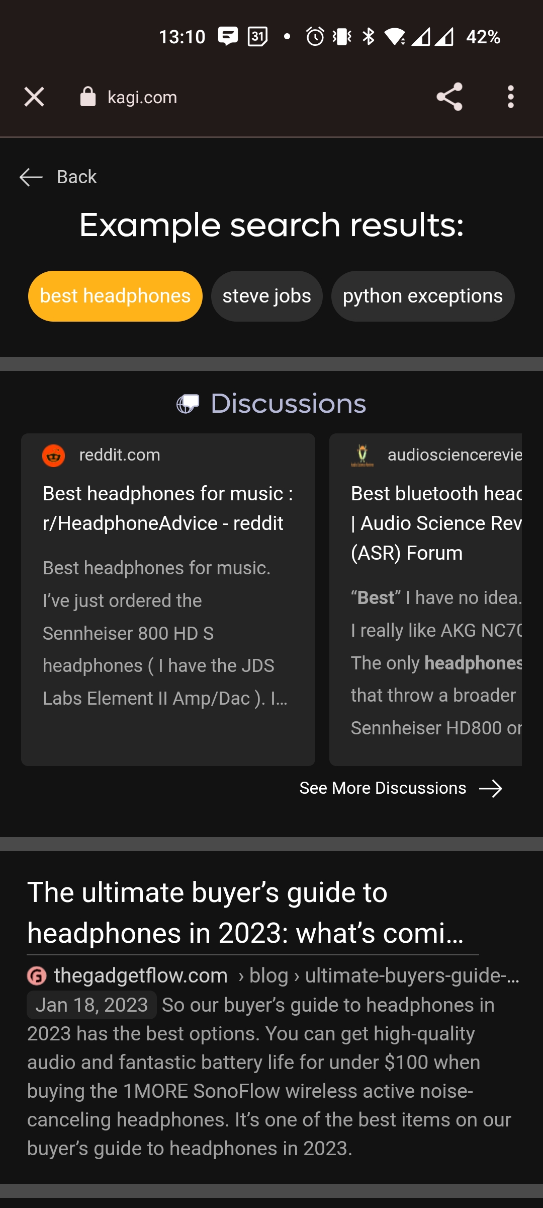
Never heard of it, just went to have a look and they had a "give it a try" button with a "best headphones" example. Note the very first result. Given the context of this thread, pretty funny 😅
