
Some weirdos write decades as possessive. Writing "90's" implies that there's a 90 that owns something.
In GD09, the front is solid and the sides are intakes. There's 2 120mm fans directly feeding CPU and one for GPU. I could probably easily cut a hole for a second GPU intake at front left, but it might not be necessessary in my case.
FLP01 and custom front panel
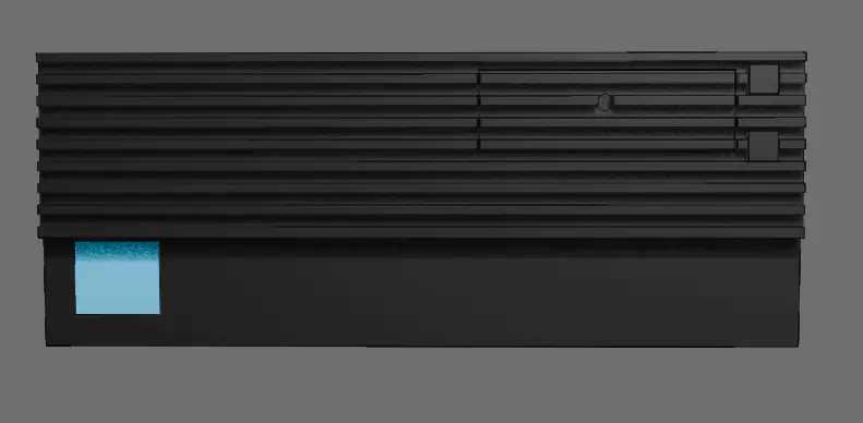
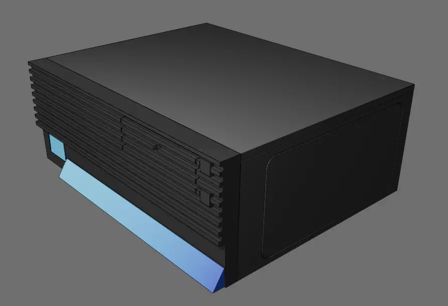
I just learned about this cool PC case a couple days ago (https://www.youtube.com/watch?v=KqyQeCbq4YA&t=221s), and I kinda want it over my boring aluminium and glass box. I like both the idea of an old looking sleeper and the horizontal pizza box form factor (or pizza box adjacent as it's whole 4U thick).
So I started thinking about possibilities. The FLP01 is just an off-white version of silverstone's normal HTPC case with a different front panel. So what if I got the case and modded it in a similar manner?
I could 3D print this, and probably post-process the surface finish to look as if it were legit. It will probably go nowhere as I can't justify buying a new case just for fun, but I wanted to share this thought anyway.
Attack
To me this looks like defense. If the site asks you to not to scrape and you do it anyway, you are the attacker and deserve the garbage.
I tried staring at a lightbulb, no effect. Never heard of this before. Maybe your local population shares some weird gene.
Guess this a good example of what I don't want to affect. IMO the examples for controversal in this thread range between acceptable and amazing.
Fuck homogenized UI design
I agree with the opinion, I like diversity, but disagree on what counts. It's a spectrum, and this is at the lighter end. I'm hoping to make the suggestions as loose as possible, just enough to avoid stuff like the first example.
Let devs do whatever they fuck they want.
The point is not to force anyone to do anything, not that they even could be forced. The point is to get people to pay attention to what others are doing instead of unintentionally reinventing the wheel. No hard rules.
Pick the app you want and then learn its icons.
There's no "the" app. For example, I don't like photon as much on my phone, and I very much don't like voyager on desktop. Relearning how to read icons when switching apps can also suck.
But anyway, I'll keep this in mind. If the reception becomes mostly negative, I'll shut up about this.
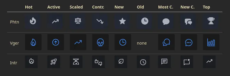
Standardize the sort icons!
Hi, I tried a new Lemmy app yesterday. I was already kind of annoyed by different sort icons when using Photon and Voyager, but something snapped when I opened the menu in Interstellar. The third meaning of this arrow was too much.
| ! | ! | ! | | ------------------------------------------------------------------------------ | ------------------------------------------------------------------------------ | ------------------------------------------------------------------------------ | | Voyager | Photon | Interstellar |
Here's a table of all sort icons:
Some of these differences I'm okay with, like controversial sort, but others not so much. Especially when the same icon is used for different things. The symbols become useless if the meaning is different in every ui. I guess because Lemmy-UI doesn't use icons for sorting, other devs just picked something in isolation.
So, my solution is to build a reference icon set that apps / frontends would loosely follow. This could then be added to Lemmy documentation. Any thoughts?
My ideas so far:
- Hot: fire
- Controversial: Anything negative or conflict
- New: leaf, sprout
- Old: clock, hourglass
- Scaled: I don't like the scale icon, but it's still better than random.
- Most comments: Multiple speech bubbles?
- New comments: Single speech bubble? I like the unread dot in interstellar.
- Top: trophy, medal, podium
- Avoid: star (reserve for favorites)
This post was kinda lemmy-specific, but I'm posting to the generic /c/fediverse since other platforms could have similar issues, and extra perspectives don't hurt.
Links:
- Lemmy sort modes: https://join-lemmy.org/docs/users/03-votes-and-ranking.html
- Material icons: https://fonts.google.com/icons
I'll have a look at the code and issues to get a feel of what I'm getting into, and then see what I'm able to work on
First thing I notice while trying this app is that these icons should really be standardized:
 |
 |
 |
|---|---|---|
| Interstellar | Photon | Voyager |
Anyway, the app seems cool. I've used flutter just a tiny bit, so maybe I can help a little.
Lokerokoodit se on mullakin ollu tähän asti. Tässä varmaan kokeillaan kepillä, kuinka paljon asiakas suostuu ottamaan mukisematta.
Matkahuollon kuningasidea
https://play.google.com/store/apps/details?id=fi.matkahuolto.paketti&hl=fi
Menin tilaamaan kirjan. Matkahuolto toimittikin paketin valitun kaupan kassan sijasta vähän matkan päässä sijaitsevaan automaattiin. No, mikäs siinä, ei matka paljoo kasva. Automaatin edessä tarkastelen tekstiviestiä vähän tarkemmin. Ei lokerokoodia, pelkkä käsky asentaa joku appi puhelimeen. No en asenna. Tarkastan sähköpostin, sama sisältö. Matkahuoltolaiset meni näköjään keksimään takuuvarman keinon kasvattaa käyttäjämäärää: asenna appi tai paketti jää saamatta. Perkele.
Panttivankitilanteen pakottamana asennan Matkahuolto Paketit-sovelluksen. Eijjumalauta, appi aukeaa rekisteröitymislomakkeeseen. Vitutus kasvaa odotellessa sähköpostin vahvistuslinkkiä ulkona noin viiden minuutin ajan. Sovellus kaatui kerran, mutta hyväksyttyäni tietojen jakamisen saan paketin ulos. Keskimäärin 1,6 tähden arvosteluissa joku sanoi, että soittamalla maksulliseen palvelunumeroon voi pyytää paketin siirtoa muualle.
Vastoin Matkahuollon mainoslausetta "Ei tehdä tästä pakettisovelluksesta nyt mitään numeroa," aion heittäytyä mahdollisimman vittumaiseksi asian kanssa. Tämmönen bait-and-switch menettely ei kai edes ole laillista.
Edit: Tili poistettu, tein pakettisovelluksesta numeron kuluttaja-asiamiehelle. Pitäiskö vielä varmistaa, että tiedot poistetaan GDPR:n mukaisesti.
HV koko postin matkahuollon väki.