Just finished this desert painting, would you like to ignore my artwork as hard as Reddit and Insta do :)?
Just finished this desert painting, would you like to ignore my artwork as hard as Reddit and Insta do :)?
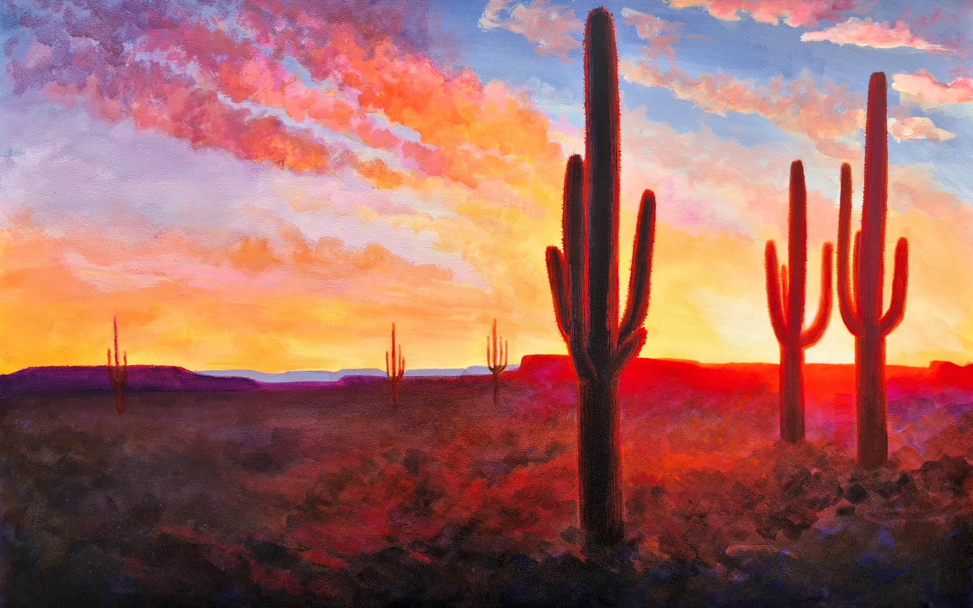 -
Saguaro Deset Sunset, acrylic on primed hardboard
-
Saguaro Deset Sunset, acrylic on primed hardboard
This reminds me of a line in Forrest Gump.
"And then in the desert, when the sun comes up, I couldn't tell where heaven stopped and the earth began."
It's beautiful
I like how bright the sun looks. Feels like there’s an actual light source. Good job!
Thanks I wanted to make this one glow!
Sorry to disappoint, but I can't ignore it. I love the strongly tinted bloom around the cacti.
Hey, thanks!
No, I would not. How did you get it to glow this much? Awesome work!
Thanks! The glow is a combination of glazing pyrrol red and vat orange over a very pale primary yellow and putting it next to darker, flatter and greyer colours. Sneaking in some quinacridone magenta always seems to work some kind of magic, over red it make it a really punchy red srifting to purple with more layers. Then i made sure i spread the colour into the objects, and up past the edges of the horizon. Vat orange punches above its weight in glow.
Very cool. I have a friend who paints from time to time. I'll make sure to let them in on these secrets. ;)
It's beautiful. You got some serious talent
Damn dude, i like the mood!
Soothing
Really awesome! The way you painted the light in gives it so much depth and realism!
Thanks! I wanted to capture the glow you get when the sun is low behind things :)
Love it! Fantastic use of light and color!
Yes.
I'd feel more at home if you asked for it as an N*T
That's awesome! I love the choice of colors and the overall lightning. Congrats.
I'd love to ignore it, but that glow around the cacti is just glorious.
Hey, thanks :)
I do not wish to ignore this. It's beautiful 😍
Wonderful !!! Magnificent !!!
It’s going to look like I am engaging by commenting on this post about how fantastic the color choices are. But I swear I am ignoring it, pinky promise and everything!
:)
I think it’s beautiful. I really like this style!
It’s great. Nice use of colors. I’m getting more Arizona vibes, but could easily fit New Mexico too. Well, I’m off to ignore this real hard. Can’t let u/spez win this one.
Thank you, my new desktop wallpaper.
That's beautiful! You should share it on [email protected] too!
It's a lil' dry (sarcasm teehee)
like to ignore my artwork as hard as Reddit and Insta do :)?
my pleasure
Looks dope! I love saguaros
this looks great! for some reason I feel like it'd make a pretty good artwork for a waiting room in arizona haha
That's a painting? Looked like a photograph. Very cool.
Awesome use of color. Love those contrasts around the dun. Not a fan of the composition of your cacti though.
Same. Great use of color but the composition could be stronger. The cacti seem a bit similar in shape/size so my eyes see a bit of a cut/paste effect on two planes. The ones in the background seem to be in a straight line giving a flat appearance when staggering them a bit would add a greater sense of depth. All-in-all I think this is really nice and I hope you keep posting here!
This sounds like very constructive feedback. Glad to see it.
Thanks for taking the time to think about it.
Amazing work, this is beautiful!
Looks good. To commemorate the historic day: I made it my phone wallpaper. Lovely stuff 😎
I love your use of the color red!
Holy shit your art looks cool af!
Is it gouache?
I like it.
Do you have any of Utah?
Not yet!