You're viewing a single thread.
All Comments
137 comments
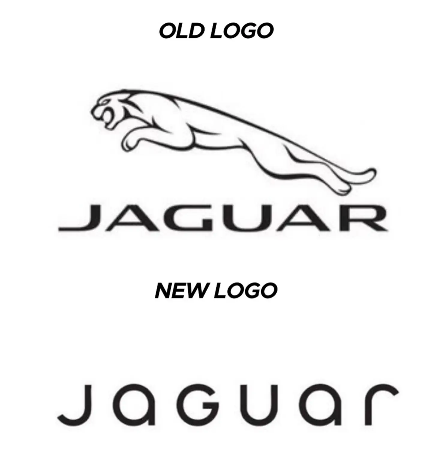
Top looks like it belongs on a nice sports car.
Bottom looks like you can find it on a new Multipla.
73 0 ReplyThat font is awful. The G looks completely unrelated to any of the other letters.
40 0 ReplyThe G looks completely unrelated to any of the other letters.
I see this, since half of the letters appear to be uppercase, and the other half lowercase:
JaGUar
30 0 ReplyYeah, I see that, too, but at least everything else is all smooth curves. The hard angle on the g makes it stick out as super different.
8 0 ReplyJaGUar
10 0 Reply
Maybe they want everyone to pronounce it with heavy sarcasm and mockery.
1 0 Reply
Bottom text looks like it belongs on some short-lived product for flavoring water or a gas station energy drink.
13 0 ReplyNo, the Multipla deserves better.
4 0 Reply
137 comments
Scroll to top

