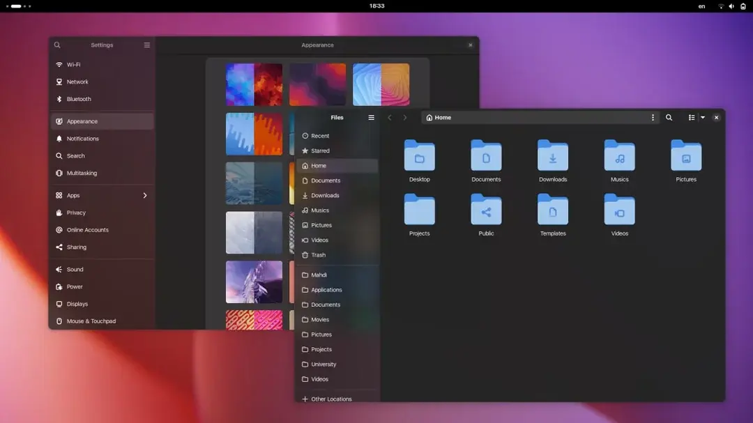
MacOS-style blurry side bar for GNOME apps
MacOS-style blurry side bar for GNOME apps


13 comments
We could ask the author of blur my shell if he could implement this too
5 0 ReplyIsn't it more like Vista style?
6 1 ReplyI WANTED THIS FOR SUCH A LONG TIME THANK YOU FOR SHARING!!
3 0 ReplyIn case you would want this, how would you use the css you provided? Not too familiar with theming gnome.
2 0 ReplyRead the first line of the CSS provided, it tells you where to put it!
2 0 ReplyThank you, really cool!
1 0 Reply
The WhiteSur theme does that for Nautilus and no other apps, it's pretty weird.
1 0 ReplyLooks awesome! How to install that?
2 1 ReplyI haven't tried it myself yet, but all you need is here: https://gist.github.com/taiwbi/0c33fa7afaa65d2a593e2f77fb3d4af6
4 0 ReplyI figured that out... But where do I put it?
1 0 Reply
13 comments
Scroll to top