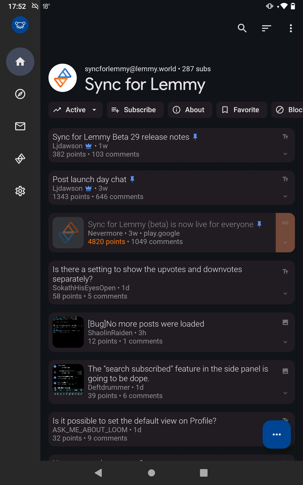
Why all this unused space at the top?
Why all this unused space at the top?


It seems that space would be perfect for the community title. If the title's too long, it could be truncated with horizontal scrolling.
Edit: problem solved!
You're viewing a single thread.
IIRC that space is a standard design attribute of Android's "Material You"
25 0 ReplyPreviously on Sync, that space was used for subreddit banners, but I'm not sure if many Lemmy communities use a banner.
6 0 ReplyDesigners, smh. Gimme a tiling Lemmy manager with maximum efficiency via keyboard only bindings.
9 9 ReplyYou carry a keyboard everywhere you take your phone?
3 0 ReplyI thought the sarcasm would be obvious but I guess not.
4 1 ReplyIt's the internet. sarcasm can get lost easily and I'd wager, lemmy has a higher percentage of autistic people than the average population. I mean I didn't catch it as sarcasm.
1 0 Reply