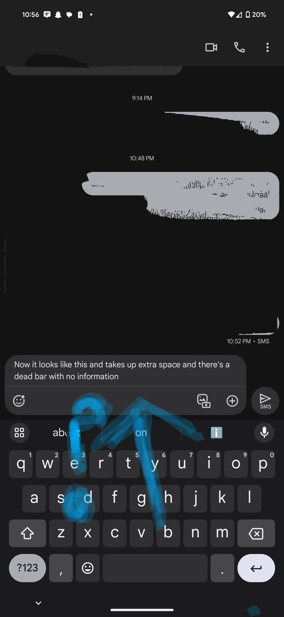
The Google messaging update looks bad. It reminded me I purchased textra a while ago.
The Google messaging update looks bad. It reminded me I purchased textra a while ago.


They really didn't have to redesign a text box. Please stop reinventing the wheel. I don't need another pop up in my life.
You're viewing a single thread.
All Comments
140 comments
Okay, so I'm not crazy. I started seeing this today, and I had to stop and think "Wait, was this always here?"
76 0 ReplyLmao same.
14 0 Replybloody annoying and ugly
8 0 ReplyUntil I saw this post I thought my phone was just being buggy.
3 0 Reply
140 comments
Scroll to top