[Community Challenge #20] Retro Sci-Fi
[Community Challenge #20] Retro Sci-Fi
Theme
This week's theme is Retro Sci-Fi!
Specifically any science fiction from the 40's - 60's. It's all about clunky robots, giant computers with dials, ray guns, and all the other old cheesy sci-fi tropes you can think of :)
There's a bonus point if the image matches the media of that era, for example by including cheap effects, obvious costumes, blurry film or anything else you can think of.
Prompt for post image:
a 50s cinemascope movie still of a clunky robot with an blinking lights on it's chest, in a fake looking space ship, a pilot is flying the ship, scene is shot with 8mm film --ar 16:9 --v 6.0
The image turned out better than how I intended :)
Rules
-
Follow the community’s rules above all else
-
One comment and image per user
-
Embed image directly in the post (no external link)
-
Workflow/Prompt sharing encouraged (we're all here for fun)
-
At the end of the week each post will be scored according to the following grid
Prize Points Most upvoted +3 points Second most upvoted +1 point Theme is clear +1 point OP’s favorite (me, this week) +1 point Most original +1 point Last entry (to compensate for less time to vote) +1 point Prompt and workflow included +1 point NEW Era appropriate effects +1 point -
Posts that are ex aequo (tied) will both get the points
-
Winner gets to pick next theme! Good luck everyone and have fun!
Past entries
- Dieselpunk
- Goosebump Book
- Deep Space Wonders
- Fairy Tales
- A New Sport
- Monsters are Back to School
- War and Peace
- Distant lands
- Unreal Cartoons
- Sustainable Ecumenopolis
- Masks
- Mascots
- Old Gods, New Jobs
- Winter Festivities
- High Tech, Low Life
- Character Limit
- Gatsby's Jazz Hands
- Reel to Canvas
- Cruelly Cute Characters
This round's winners:
| Place | Winner | Points |
|---|---|---|
| 1 | @[email protected] | 6 |
| 2 | @[email protected] | 5 |
| 2 | @[email protected] | 5 |
| 3 | @[email protected] | 4 |
| 3 | @[email protected] | 4 |
You're viewing a single thread.
"Private iDetective" starring ai-Rick Rossum and Veronica Lake.
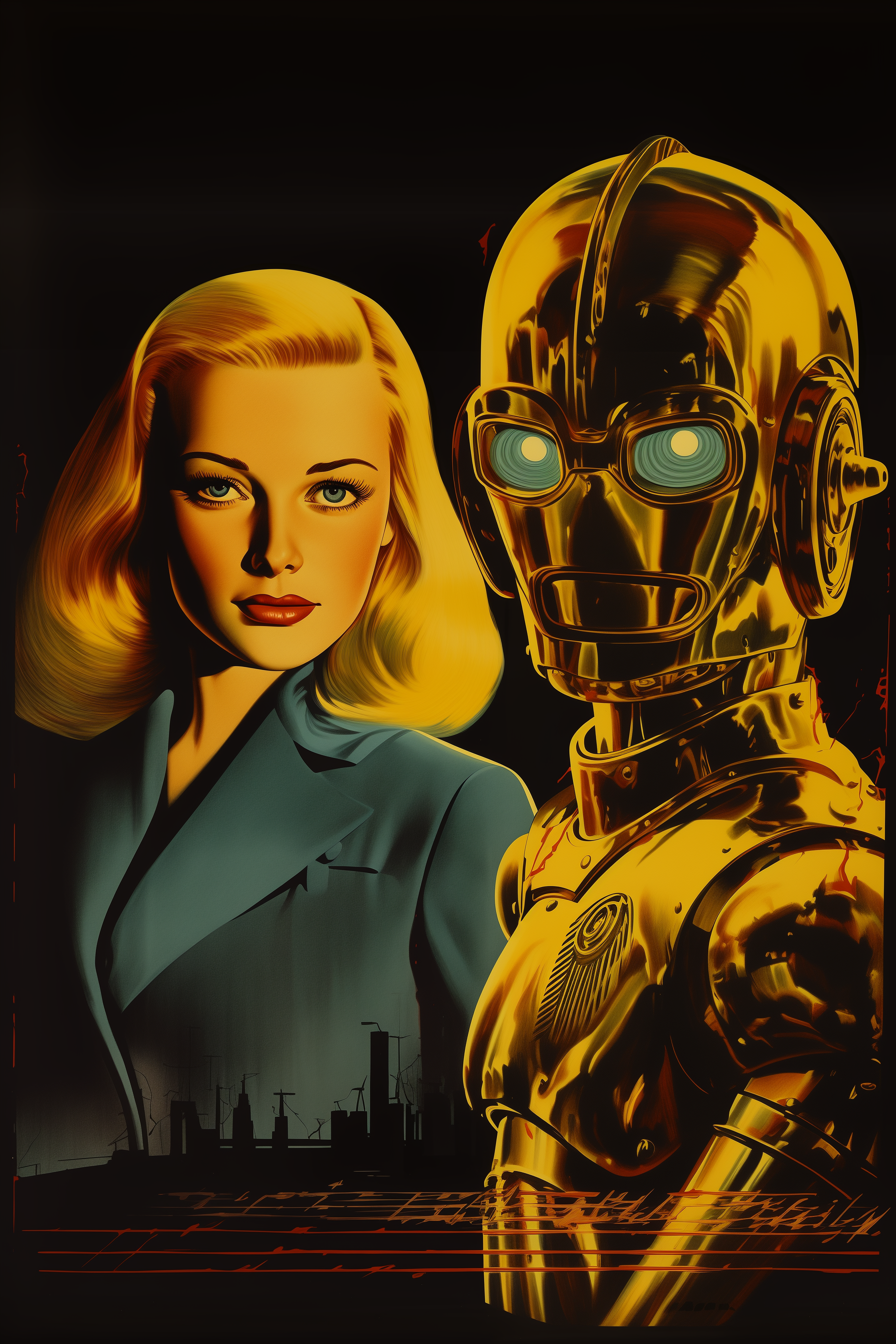
I tried oh-so hard to get it with text, but I haven't secured a contract with that particular demon yet... curses Midjourney
spoiler
"Private iDetective" film poster starring veronica lake, and a robot sidekick. in the style of sci-fi noir, graffiti-inspired illustrations, film noir, golden age, retro-futuristic, 1940s-1950s, medium shot, balanced, three-point lighting, high-key lighting --ar 24:36I added my own quick title just for fun afterwards
spoiler

That looks really good! Too bad about the title, but I can definitely relate. I've been too often in the situation where the image is perfect but the text is wrong, or the other way around.
Best you can do is to increase the stylize for a higher chance at an accurate text, but then you'll lose out on the style you're trying to emulate.I think you made the right choice with adding it in by hand :)
Category Points Theme is clear +1 Workflow included +1 Era approriate effects +1 Total 3 points Again, too bad about the text. Still, I really like the style of your image. It's very refined.
Next time just add the text in by hand, I'm pretty sure some light post-processing is allowed. Especially if you are honest with it up front.If I can do minor tweaks that would be very helpful! Thanks!